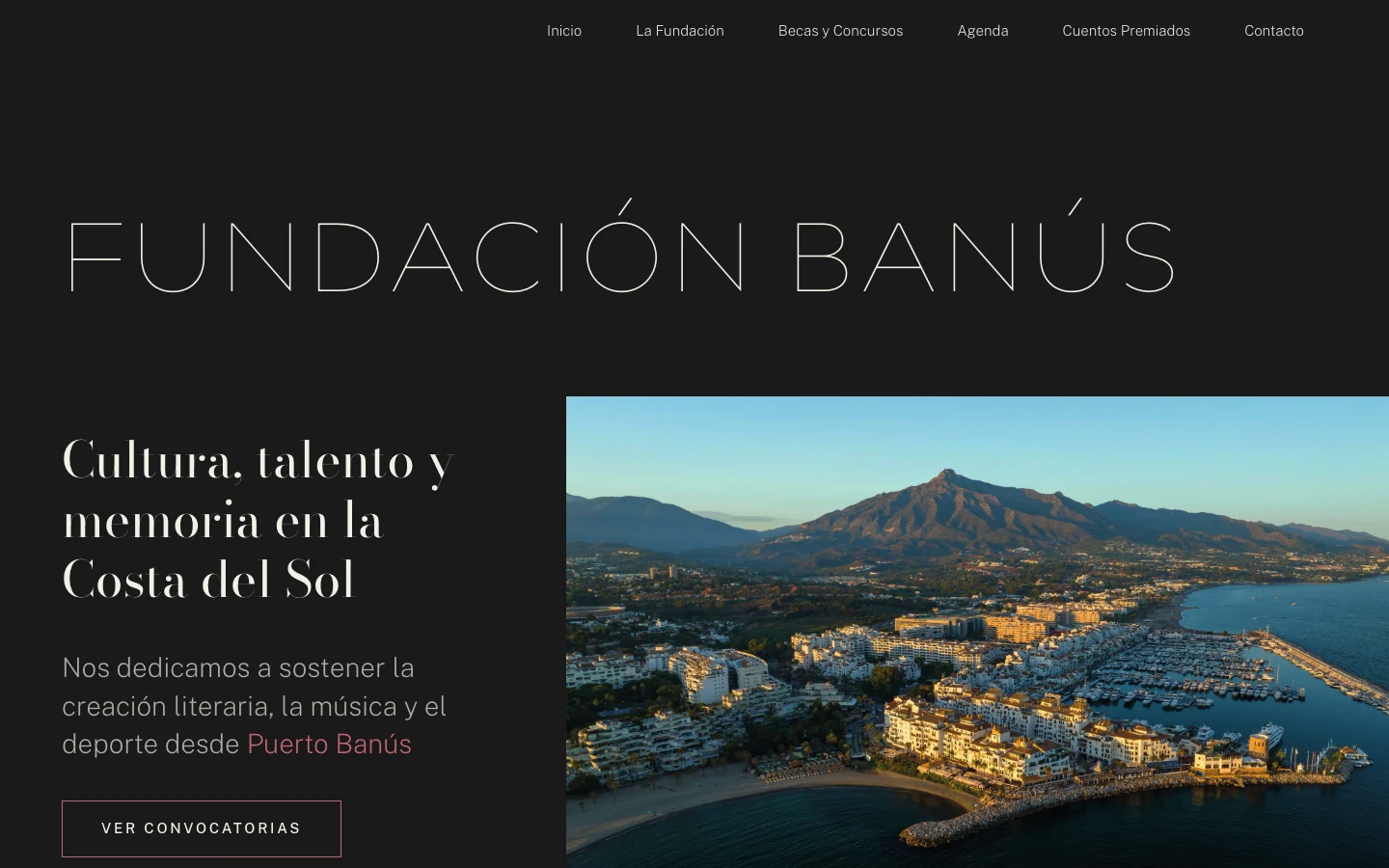
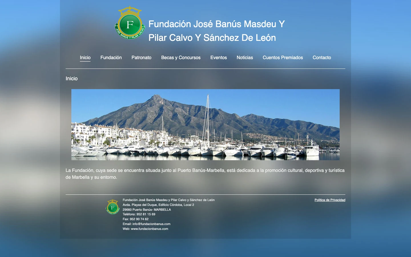
Fundación Banús has been promoting culture and sport on the Costa del Sol since 1998: grants, concerts and a short-story competition now in its twenty-sixth edition. Its website was a WordPress site that had fallen behind —old content, an inherited template and nothing underneath to hold it up— and they asked me to rebuild it. From scratch. Thirteen pages, a design system of its own and a way of presenting events that didn’t exist before.
01
the system
Before laying out a single page I built the system: the colours, the typefaces, the spacing and the recurring pieces, each with its own name and in one single place. Inside the pages there isn’t a single stray colour or a hand-typed margin. And it was needed, because no two of the thirteen pages are laid out the same: some are indexes, some are records, some are documents. It’s the part nobody sees, and it’s what makes the layout work rather than come out right by luck.
Fundación Banús · design system · three surfaces
Display · Deuterium 100 Fundación Banús
Cultura, talento y memoria en la Costa del Sol.
Public Sans at weight 200 for long text, because at 400 it looked too heavy next to such a thin display face. The links don’t use the strong pink: they use the light one, which is readable.
1998 desde 668 cuentos 5.000 € premio Convocatoria abierta
backgroundwarm black#1A1A1A
sand#D4D2CA
paneldark grey#3B3A3D
mid grey#656468
textoff-white#F2F0E6
headingspink#C26474
linkslight pink#C6919A
wine#6E4A55
opengreen#AAC3A2
dark green#3A5D30
Measured: pink on black gives 4.45:1, just below what body text requires. That’s why there are two pinks: the strong one for headings and figures, the light one for reading.
02
the events
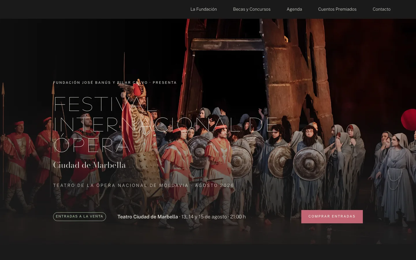
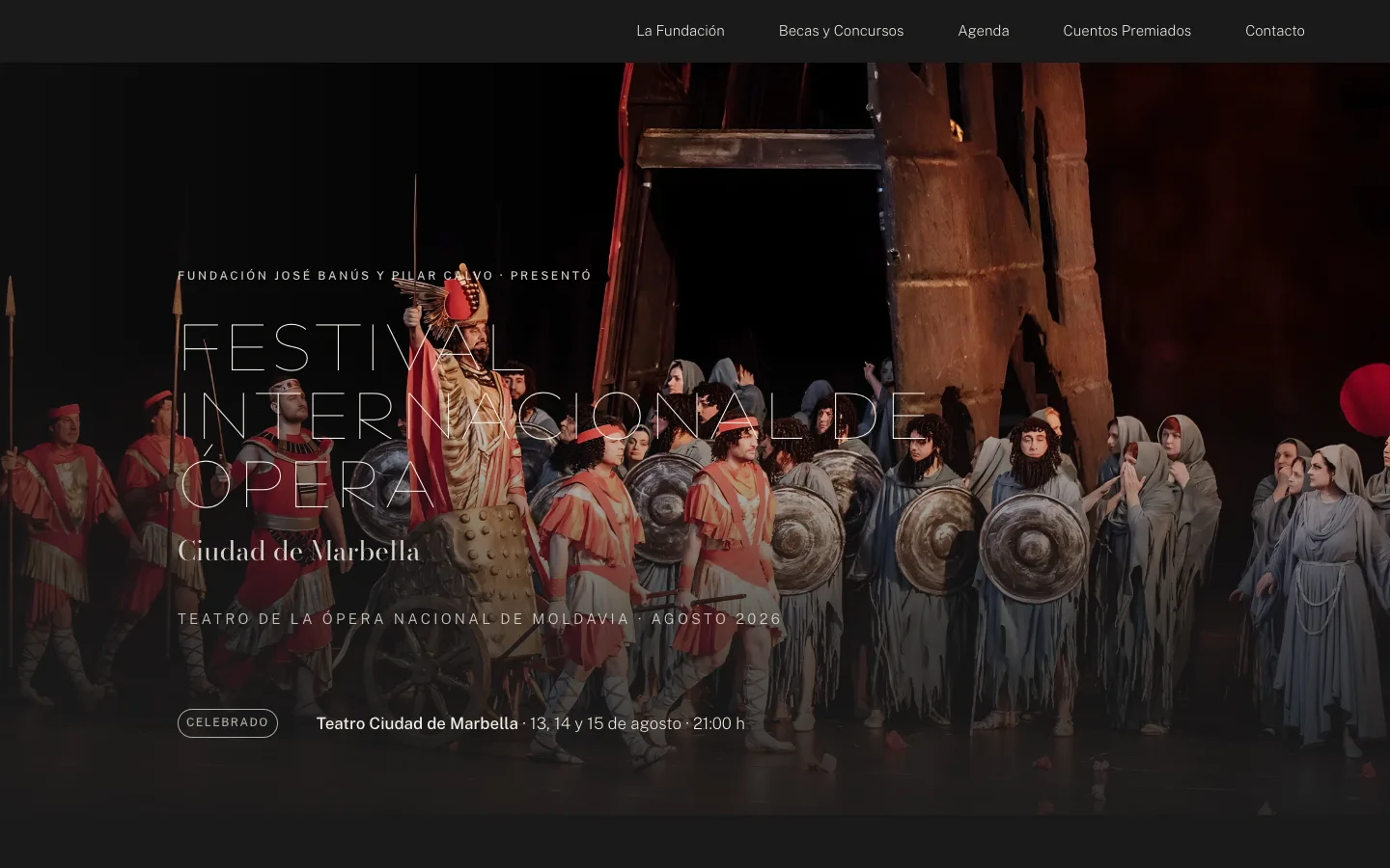
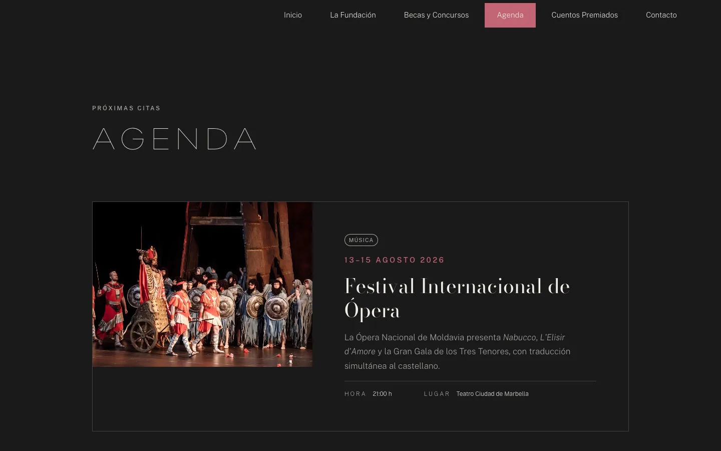
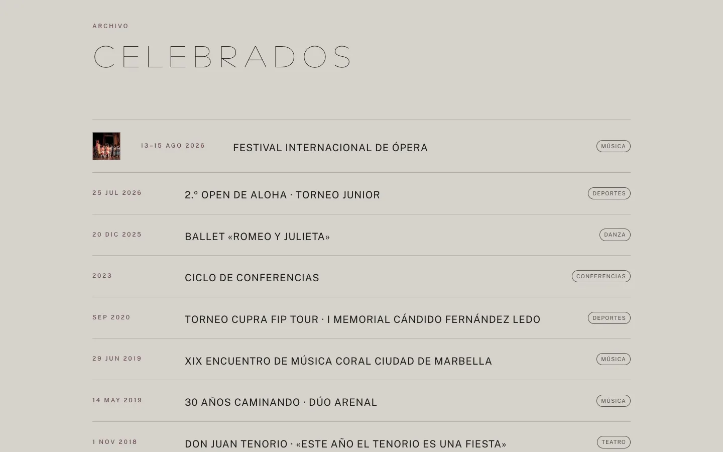
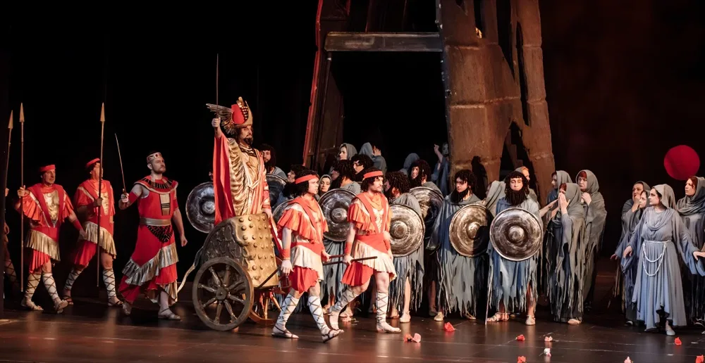
An event doesn’t expire: it changes state. Here each one has a single address for its whole life, and two faces. Before, it’s the announcement —date, venue, tickets—. Afterwards, without moving, the verb changes, the ticket sales go, the “Celebrado” (held) stamp arrives and in the listings it jumps from upcoming dates to past events. This isn’t decoration: it’s deciding where each thing lives.
fundacionbanus.com/ festival-opera.html
Celebrado
The same address. The verb changes (presenta → presentó, presents → presented), the ticket button goes, the stamp arrives.
fundacionbanus.com/agenda.html
And in the listings it jumps from “próximas citas” (upcoming) to “celebrados” (past events).
03
the rules
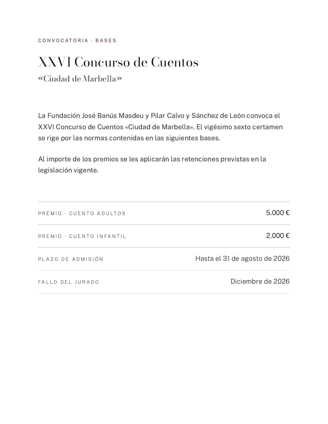
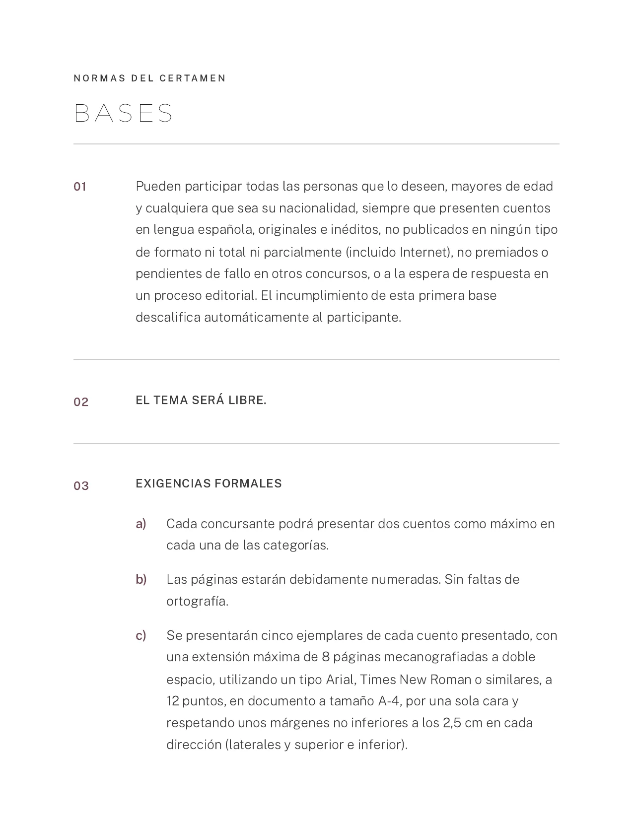
The rules of the short-story competition are a long legal document, and some people read it on their phone while others print it. It’s laid out for both: numbered articles, a clear hierarchy and enough breathing room not to lose the thread on screen. It’s the only page on the site without a footer, and that’s on purpose: when you print it, the menu and the legal links are just in the way.
The competition rules on a phone, from top to bottom: title, call for entries, prize and the numbered articles.Printed straight from the browser, as is: six A4 sheets, no menu, no footer.
04
on mobile
The listings could have been a grid of cards, which is the easy option and what everyone does. Instead they’re wide rows: the image on one side; the date, the title and the details on the other. It reads like a magazine page, not a catalogue. The price is that a wide row doesn’t fit on a phone: it has to stack, and when it stacks, what can’t change is the order you read it in.
1
Música
2
3
Festival Internacional de Ópera
La Ópera Nacional de Moldavia presenta Nabucco, L'Elisir d'Amore y la Gran Gala de los Tres Tenores, con traducción simultánea al castellano.